Hi.
Found a bug? Think something's broken? Think a feature might make the site better?
Post about it here, and read the thread in advance to make sure it's not been reported already or requested.
If you can reproduce it/diagram it out for us, even better.
Think you found a security vulnerability? A critical exploit?
Please email us directly at [email protected] with a description and your username.
If legitimate, we just might have an exclusive forum reward waiting for you...
SHAPED OR MOLDED FORMS appear to have been formed from a plastic material through directly applied force.
ABSTRACT FORMS are of uncertain origin.

a way to "follow" specific threads and get notified whenever someone posts in them
ab aeterno, et aeterno

Nice to see the site's back online. Good job with the forums so far.
All I humbly ask is that button { cursor: pointer; }
HE IS
ABSOLUTELY
KILLED!!!!

when looking at someone's profile you can look at replies to topics someone has made
i feel like i should be able to click a link that leads back to that topic. theres the permalink but thats just the reply on its own theres no way to find the context other than guessing?? and/or searching the forums


Would be great to have an easier way to navigate to threads/sections lists without having to back via the 'Forum' option at top.

- Egosearch
- Quotes
- Links
- Edit/delete posts
- Disable signatures
- Ugly monospaced font (I get that it's supposed to be Homestuck, but it's not bolded, displayed at the wrong size and MSPA Forums wasn't like this for a reason)
- Wasted space (80% zoom is less painful, but I should be able to see more than 3 short text posts on my screen at the same time, REPORT USER button should not be taking up 50px of vertical space on every post)
- Pagination not shown per-thread when viewing list of threads
- No jump to last page/most recent post
- Unwieldy navigation which doesn't consider the most common use cases
- Timezones
It's borderline unusable and will hurt activity even if people don't complain, you should've gone with phpbb or vBulletin.

Is anyone else having trouble editing their profile / description? I get the client-side exception error every time, and on different browsers.

There's a really funny bug where if you log out and look at the forums, the forum still thinks you're logged in and spams you with the "Unable to fetch notification count. Are you logged in?" notification.


wishlist: sweet bro and hella jeff subforum
the revolution is now :o)


- Post form doesn't clear after you make a post
- Fake navigation that updates the page content and adds a history entry without actually navigating to a new URL is bad UX, especially since there is no indication given that the page is loading
- Hovering many buttons doesn't change the cursor
- Pagination buttons change color when hovered but an ugly border-radius shows up
- Currently active pagination button at the bottom of the page has the same background color as its parent
- "Back to top" button
- Reply button should be duplicated at the top of the page, I had to search for it initially
- Usernames don't respect capitalisation despite the signup form showing ectoBiologist as an example
- Long overflowing signatures capture scroll attempts when attempting to scroll down, just hide the overflow and users can fix them to be an appropriate size
- Permalink showing the post in isolation is not useful, it should link to the thread in context and jump to that post
- Clicking the buttons in the editor doesn't highlight them until after you type a letter, causing confusion if you clicked italics before typing anything creating an italics state which you can't backspace out of (I'm not sure the editor is salvageable, but the forum isn't really either)
- Raw editor in Markdown/BBCode
- Spoilers
- Links back to parent subforums from a thread
- Both the display name and username being part of the same anchor feels bad, better if only the username is a clickable link, I would also make the avatar a link
- "Recent post" titles on the front page do not underline on hover
- On the subforum list, post titles do not underline on hover
- On the subforum list, topic and author anchors fill their entire cells, better to make the post title, username + avatar clickable links only
- On the subforum list, an effort was made to trim the preview of post content shown under the title, but on smaller displays it still wraps filling multiple lines, better to keep it to a single line (you could use text-overflow: ellipsis)
- If you're on page 6 and submit a post, it takes you back to page 1 (should instead take you to the appropriate page and jump to the post you just made)
- Toast notifications are really ugly and annoying, better to show errors as part of the page in a text element that doesn't fade
- Please add a little color, somewhere
I'd like a little more room for expression with signatures. People making entire posts in neon pink would get annoying fast but they should be able to have a signature that hurts to look at.
Magic is FAKE AS SHIT/FUCKING REAL

- New topic button (inconsistent with other ALL CAPS buttons) doesn't belong on an individual thread page, that's where the REPLY button should be
- Recent unread posts indicator doesn't update correctly when you view the posts by clicking the pagination without properly reloading the thread
- VIEW POST IN CONTEXT doesn't jump to post (use anchor jumps, alternatively remove this page and make the permalink go to the anchor jump)
- Only the text is clickable of the VIEW POST IN CONTEXT button
- Privacy Policy and Contacts (should be Contact/Contact Us?) links in footer don't underline on hover
- If you accidentally click a link while writing a post and then go back, your half-written post vanishes (if this site wasn't a DOM-molesting Javascript abomination, you'd get this for free)
- "(User has posted no topics.)" text and I assume other error text on the profile page when clicking tabs is too dark to read
- These profile tabs can't be reached via the back button, so if you're browsing someone's posts, click a post, then go back, you won't return back to the list of posts and will have to click the tab again. I recommend making the topics/replies tabs separate URLs, and to show user comments + roles on this page by default
- Profile tab buttons show no indication of which tab is selected
- Profile tab buttons have ugly double borders
- No profile tabs are selected by default, which seems pointless
- There is no way to get directly from the replies profile tab to the thread and page of a specific post, you have to click Permalink, then click View Post In Context, THEN if the thread is multiple pages you will have to individually navigate through every page to reach the page the post is on (you have no way of knowing which). Replies tab posts should at the very least show the thread they are from with a link, but more work is needed
- An unnecessary horizontal rule is shown under posts that do not have signatures attached
Wishlist: Quote button, edit button, and search function.

Ability to react posts with emoji would be real nice.

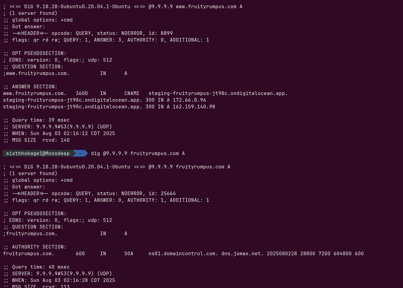
There's no A/AAAA or CNAME records for the bare domain fruityrumpus.com, only the www subdomain. This means https://fruityrumpus.com/ results in a "server not found" error from the browser instead of being able to redirect to https://www.fruityrumpus.com/
Listen to Pgenpod: https://archive.org/details/Pgenpod-Network
Epilogues ebook: https://github.com/Sixthhokage1/HSEpilogues/releases

can there be some way to favorite a thread? i want to be able to easily find threads other than just my own and being able to favorite them to get notifications when they update would be pretty cool too. no idea if the servers can handle that much data currently but i hope it will become a feature soon!


just thought of another thing that i really think would be good and thats actual replying in forums because currently just like saying "re: trwerwr33rrwwfe3efwr56ey4u65adwhwd" or just quoting the entire thing your replying to seems inefficient and annoying although i dont know how typical that is for forums.
The description of the MSPA section reads, "For Problem Sleuth, Bard Quest, and Jailbreak." This technically means there is no stated location to discuss Homestuck, The Epilouges, and HSBC, despite the MSPA section being in the "Homestuck" category.

@illusorymechanist If you just click the white box that says Homestuck without clicking a subcategory it takes you to the Homestuck forum. It is a little unclear.
@illusoryMechanist
there actually is - the text above the other three subforums! there is also one for FRAF overall. i do wish this was a little more obvious though, they look like just plain text!
