What are some changes you want to see to the official Homestuck website once it's up and running? Personally, I'd really, REALLY hope they get rid of (or at least change the placement of) the ad banner here.
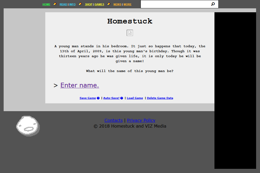
This is seriously really bad looking and I think there are a million better places this could have gone, like above or below the page. (probably above the page, so the fifth wall stuff during the doc scratch and hussie segment in a5a2 would go over it like it did on the original website, if i remember correctly)
This is secondary, but looking more like the original mspaintadventures.com would be nice. It has a charm I feel like homestuck.com is missing
